
by Eugénie Besson
Media Studies Blog
Flatplans & Fonts
On this page you will be able to found drawings of the cover, table of content and the double spread of my magazine which enable an overview of the initial product.
Most details may change and the modifications are found in the Coursework development section
Additionally, my options on different fonts found in the magazine is explain below, but the final choice for each, will be found as well in the Coursework development section.
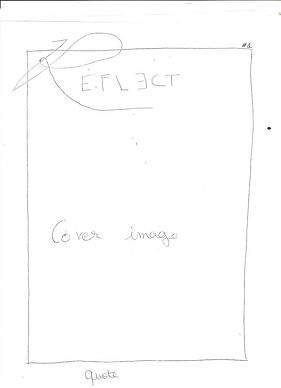
Cover
Font options


In order for the viewers's main attention to be on the picture and the Masthead, I searched for simple non-serif fonts for the tagline and issue's number.
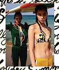
I have in mind a really minimalist cover, with only the Masthead, the issue's number and a quote. It will highlight the artistic feature of the magazine while the tagline will be a quote from the main photo-shoot of the magazine.
I also wanted to include a large white border to the cover where the Masthead will surimpose on the border and the image.


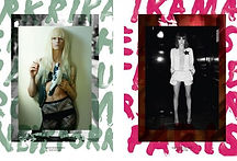
Some Inspiration
 |  |  |  |
|---|---|---|---|
 |  |  |  |
 |  |  |  |
 |  |
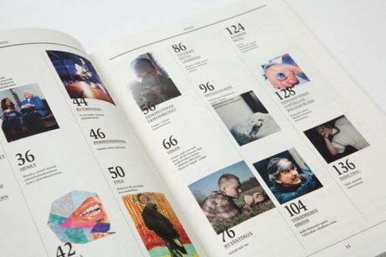
Table of content
You may find even more information about the table of content on the ToC choice&design page.

Font options
I planned to include approximately 3, 4 or 5 pictures on the table of content double spread, with all the article's title clearly visible following its page number. The whole layout looks enough symmetrical for the readers to read through it easily.
The title, which should be "Table of Content", may be the main aspect of the layout to be artistic by its font. The use of colors and graphics will also add a creative touch.


I searched different handwritten/paint font for the title of the ToC, in order to reflect the creatives features of the magazine.
To have an effect of symmetry and order, all the articles will have a really simple non-serif font. It will contrast with some artistic pattern of the layout, to connotes the elaborate content on cultural issues.
Double Spread
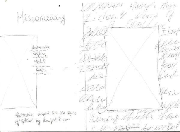
The double spread will involve the beginning of the article "Misconceiving", as it is my preferred topic and contain more appealing pictures.
My initial ideas for the left page is quit decided : I wish to have one picture in the center, with in a background filled of sentences or words in a handwriting font.


Some inspiration

Font options


I have searched for non-serif font, to have a straightforward impact on the reader, and to keep the idea of a refined result.


For the credits, I considered similar fonts than the title, to keep a coherent connections and for the visuals content to appear more significant.


The font for the lyrics of the song, which will appear on the right page, is more for a graphic purpose.
The choice to have a handwriting font is for the concept that it's something personal from the artist intimacy.
My decisions for the right page is still changeable, but I plan to have a brief introduction to the article with more visual content, such as a picture or some graphics.
With the idea in mind that the right page will be filled of handwritten sentences, I plan to have more a minimalist layout for the first page.
Some inspiration


