
Website creation
- 27 janv. 2019
- 3 min de lecture
Dernière mise à jour : 9 mai 2019
Final version: htps://bessoneugenie.wixsite.com/sashasloan
On this post you will be able to see the process of the artist's website and my explanations.
My ideas are based on style of Sasha Sloan as I already analysed in the digipack and website research posts.
I decided to use the platform Wix to create the website simply because it offers a wide range of tools I am already familiar with.
I first started to chose a music template that pleased me in order to gain more time for the organization of the pages and to guide me into a conventional music website as well.

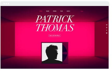


What attracted me the most was the home page, the first thing you see when you click on the website, where the artists 's name stand out and the social media bar menu appear on the side, these are actually what I keept.
I did some major changes, such as erasing all the pages, simplified the home page and changed the visuals to create something more minimalist and appropriate for my artist.
But I still got inspired by the design layout for the Tour and Music pages.
I wanted the viewers to navigate through my website really quickly and easily, so to have a really straightforward design layout. To achieved this I decided to take out scrolling, to have access of the pages directly on the same screen, to diminish the visuals and to have a limited amount of content. These characteristics are actually similar to indi/pop artists.
Some screenshots of the process:


In order to captivate more the viewers, and to add a an aspect I haven't seen in others websites, I decided to add a shot of the music video as a background for all pages. To achieve a correlation with the digipak I choose a footage from the empty room location, which have the same color pallet than the visuals found in the digipack.
The font used are the same ones appearing on the digipack, establishing again a link between them and keeping a brand image.
Home page: Only the video of the background is standing out and the viewers need to click on the categories displayed on the right in order to access to content.
Music page: The music video appears first, as it just came out, to appeal the viewers but also because the page has a chronological type of content.
Tour page: It consists to provide the official dates and links for the concerts of the artist. She is independent and not necessarily well known so to have access to the proper list of her performance it is easier and more secure for the fans to buy it from the website.
Shop page: Sasha Sloan recently opened an online shop in order to sell clothing related to her music. As it is a relevant aspect of promotion, I decided to included it on the website, whereas the fans can also be sure of the authenticity of the products. I tried different options to present the clothes as showed on the screenshots. To keep a refined look, I edited the pictures of some products, I selected only the object and with the option "refined edge" I made the background transparent. Than I arranged the final results on the website for the viewers to have an outlook of the merchandises with access an external link for the official shop.
Sign up: She is an independent and not internationally known, so I decided to have only essential type of content and however limited. So the idea for this option is for fans who wish to found out more about the artist and even show her more support. They can sign up with their emails in order to discover exclusive content such as weekly news or exclusive footage of the backstage of the music video for example.

Commentaires