
Digipak Research
- 15 janv. 2019
- 3 min de lecture
Dernière mise à jour : 25 janv. 2019
In order to create a successful outcome, I decided to observe several digipaks, to search for inspirations and to create drafts.
Having in mind that my artist's music has a pop or alternative/indie genre, I looked through different digipack to identify the main conventions and to discover different style.


The mainstream hip-hop albums, particularly known artists, have bright and contrasted colors which attract the attention of viewers and the model occupies the whole frame with a specific body expression. Their name and the title of the album is clearly written on the cover, on the CD and behind the track list is apparent. However the main focus here is mainly on the artist, because consumers are likely to be attracted to the artist rather then album name. For Rihanna, the font has a minimal style: a bold, sans serif font is used, letting the picture to be more visible and recognizable. Cardi B opted for the square pattern to be mainly exposed on her album and Niki Minaj chose paint pattern, both in order to reflect their style and to attract the attention.
The imagery used on all components of the 4 digipak are all related and the color scheme used remains consistent throughout.
Each of the singers have however their own choice of style and mise-en-scene, as the fonts, the colors, the design layout, the position of the artist and the main theme represented differ from each. For example Rihanna's digipack reflect the emotional songs she has in her album with themes such as love and weakness.
For artists who are similar to Sasha Sloan (indie pop genre) some similarities and differences can be made comparing to others genres.


It is clear that here the main focus isn't the artist, only Lana Del Rey (2dd) poses on the cover of the album but still doesn't stand out as Beyoncé or Cardi B. There is a greater wish to create meanings and to intrigue the viewers, such as for Sia's album (1st) and Melanie Martinez (3rd). These characteristic reflect their genre which is more melodic and less abrasive and more open to different be interpretations . Lorde's digipak (4th) is extremely simple with no images, only a black color scheme and white writing, which challenges the mainstream albums. Melanie Martinez created a interesting aspect on her product: the title is actually real balloons on the picture, contrasting the others, the text isn't added but is part of the composition of the images, something I haven't seen a lot.
Conclusion: The main conventions I will definitely used for my work is to mention the title the name of the artist and track list, and each parts (the cover, inside and the back) will be correlated. However I wish to play with the composition of the digipack's design to create something unique with my own ideas but still following the brand image of Sasha Sloan.
Sasha Sloan's covers and style:


Overall, by she has a minimalist style, subtle connotations and doesn't expose herself as much as hip-hop artists on her covers.
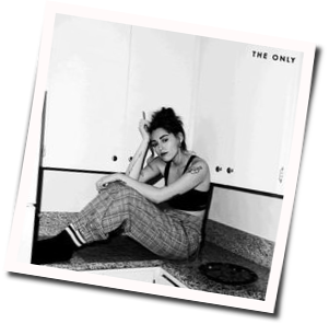
For example on the cover of her EP1 "SAD GIRL" the picture is a selfie but her face is covered which is intriguing. The same for the covers of the songs "FALL" and "NORMAL", her face is not clearly showed but the composition is more artistic. The focus is more on the actual music product than on her appearance. However she also has personal pictures for certain songs' cover: one whereas she brushes her teeth, one picture when she was younger and a Polaroid. This denote the fact that she is really simple and honest, she does not try to build a certain image but tries to stay natural, creating a strong link with her audience. Not all of her covers contain pics of her: for "HURT" and "HERE", she opted for a certain composition of her images with props such as flowers, reflecting an artistic feature.
For most of the titles, they have a non-serif bold font and are written in capital letter: it is really simple and straightforward. This is also apparent in the traklist, the design layout is really purified: the black simple non-serif titles and numbers, organized in columns, stand out from the white background.
But for the songs "FAKING IT", "LOSER" and "OLDER", the title has a handwriting font creating a more natural effect, something I wish to include for my digipack.
Inspirations:


Commentaires