
Planning Minor Tasks
- 16 janv. 2019
- 2 min de lecture
Dernière mise à jour : 19 avr. 2019
On this page, you will be able to observe the planning of my digipack and website, such as the pictures, the draftplans of my digipack and the choosen fonts.
For the creation of the Digipack and Website, I decided to take pictures at the same time I was shooting the actual the Music Videos, instead of a special photo-shoot apart.
I selected at least 10 pictures and edited them on Photoshop:
1. Empty room


I just cropped most of the pictures, adjusted the contrast and brightness, sharpened some part and modified some color balance.


2. Rose


I first adjusted the brightness and contrast of each pictures, modified the curves levels and used the color balance option to intensify some colors as well as the sharpen tool for the shape of the rose to stand out more.
Then, with the Liquidify option, I used a tool to in large the shape of the rose in each pictures.
3. Bedroom


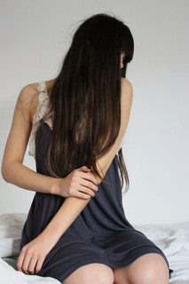


For most of those pictures I decreased the brightness and the saturation, increased the contrast, used the sharpen tool to intensify some elements and adjusted the light with the curves level setting.
4. Botanic Garden


I tried different type of settings: for some I decreased the brightness and slightly the saturation , as well as I increased the contrast and modified the curves level and for others I increased the saturation and modified differently the curves level.
With the slamp tool I erased the headbands, to lead the focus on other aspects of the image.
Moreover, my final touch was to use the sharpen tool to intensify the movements of the dress and the leafs.

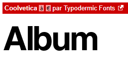
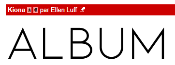
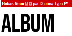
Fonts:
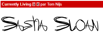
Following the genre and the brand image of my artist, I decided to select simplistic and handwriting type of font on DaFont, which will appear on my website and digipak. I will try them all during the coursework process and make my final choice after the trials in order to have a satisfying result.
Following an extend research on the brand image of Sasha Sloan and also for aesthetic reasons, personal preferences I decided that an non-serif, formal style of font is more appropriate for her name and the name of the album.


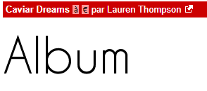


For the rest of the writings, like the track-list or the titles in my website, I looked at handwriting font to have a nice contrast with the name and album's title but also because of Sasha Sloan tendency to use a raw style of font in some of her singles cover.


Commentaires